Creating Contenda’s first design system
Upon joining Contenda, I faced an outdated color palette, a few typography guidelines, and nothing else. This case study explains how I created Contenda's first design system to optimize for accessibility, consistency, and efficiency.
1 designer (me), 1 pm, and 2 engineers
Design systems, visual design, React.js
Shipped
1 month
Context and challenge
When I joined Contenda, we had a roadmap full of new feature releases but a platform full of UI/UX inconsistencies. As the sole designer, I had the responsibility of bringing structure and uniformity to our platform's UI/UX.
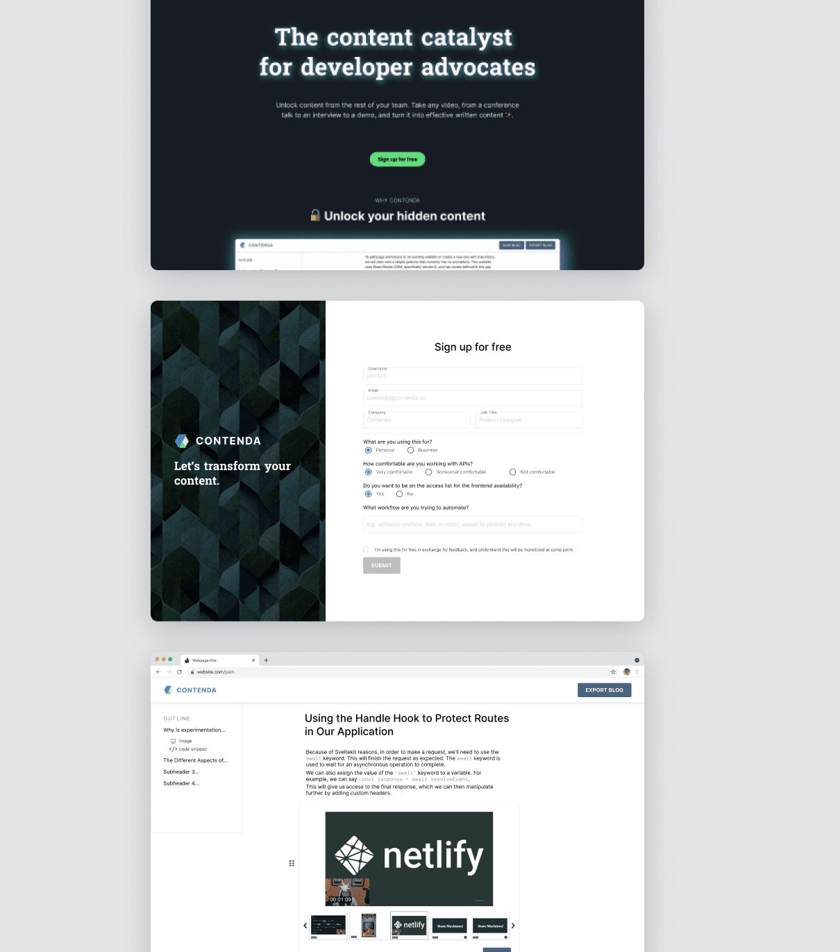
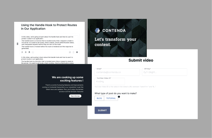
Lack of accessibility coupeld with visual inconsistencies across the old platform
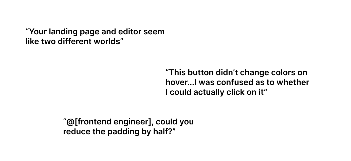
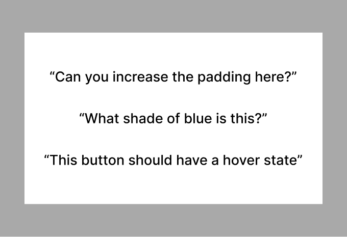
Few of the many user & internal inconveniences, caused by the lack of a design system
My proposal for a design system was initially met with doubts. While I stressed its benefits for improved UX, others struggled to see the broader value. Engineers favored developing new features, product preferred my involvement in user research…how might I communicate the value of a design system and create one while juggling other projects?
Securing Buy-in
Reframing my approach, I presented the design system as a strategic tool. I emphasized the three principles of consistency, accessibility, and efficiency, and connected each principle with tangible problems and fixes. The team fully embraced my perspective, acknowledging the far-reaching benefits they hadn't previously recognized.
Consistency
Problem: Inconsistent visuals disrupted UX and weakened Contenda's brand.
Fix: Standardized core visuals and layouts.
Accessibility
Problem: Overlooked users due to weak visual contrast and incompatibility.
Fix: Elevated design to meet AA accessibility standards.
Efficiency
Problem: Excessive design-engineering discussions on design specifics.
Fix: Created detailed component documentation.
The three principles I presented to the team
From principles to design
With a green light from the team, it was time to roll up the sleeves and start designing. However, the frontend and I were handling 2+ projects simultaneously, Instead of creating a comprehensive system at once, I expanded the system along the way, even implementing some, thanks to my previous frontend engineering experience.
My goal was to avoid superfluous efforts by building on existing efficiencies. I analyzed established design systems of IBM/Google/Atlassian, and considered our use of React's Material UI Kit and legacy designs. These together provided a foundation for identifying enhancements and integrating best practices from industry-standard systems.
Here are a few examples of how I designed the components while adhering to the three principles.
Case 1: Redefining colors
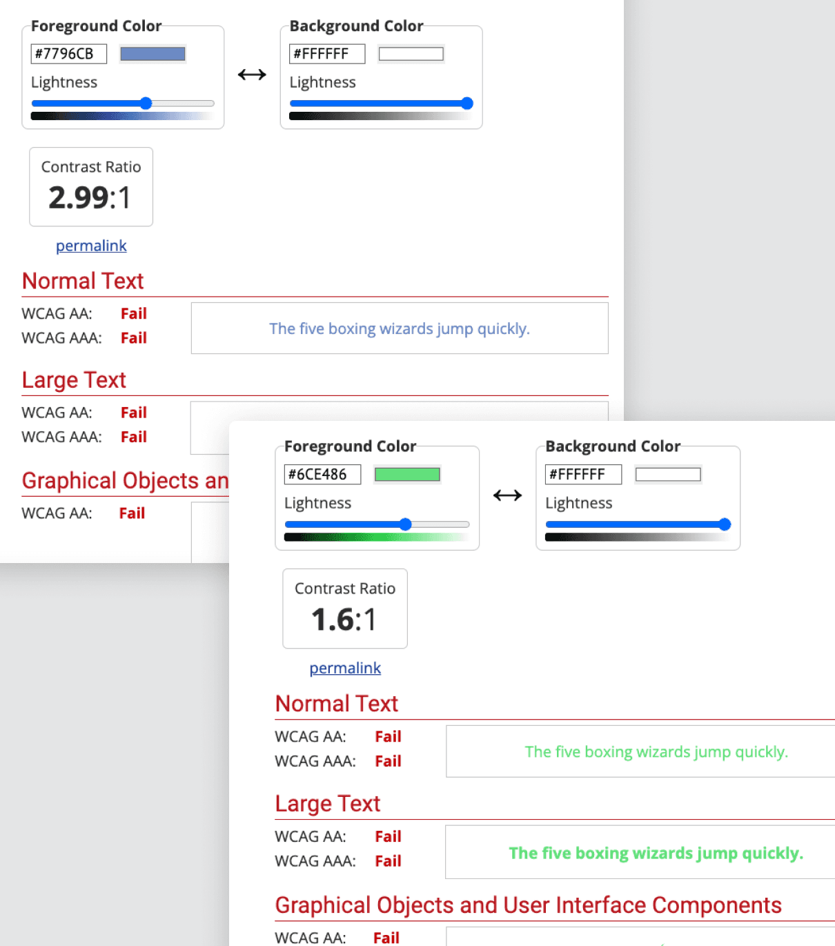
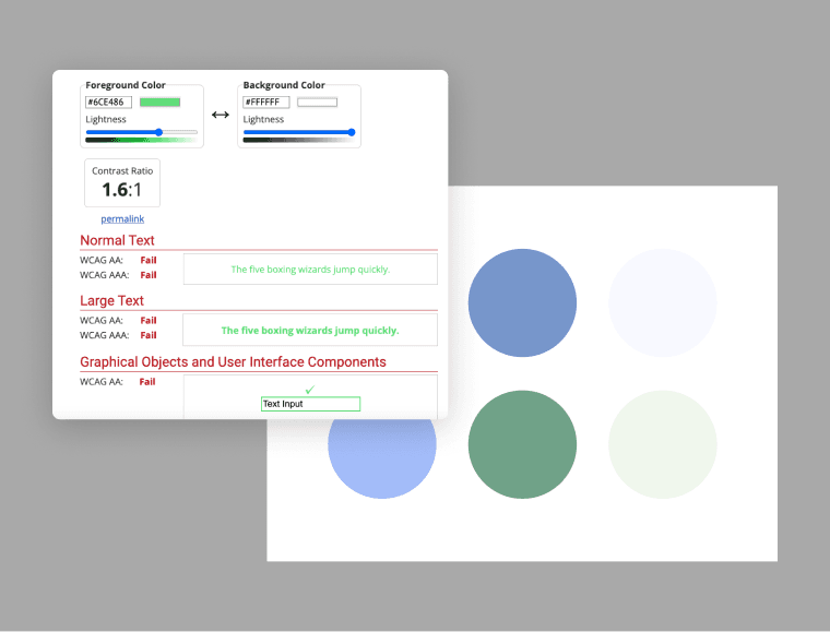
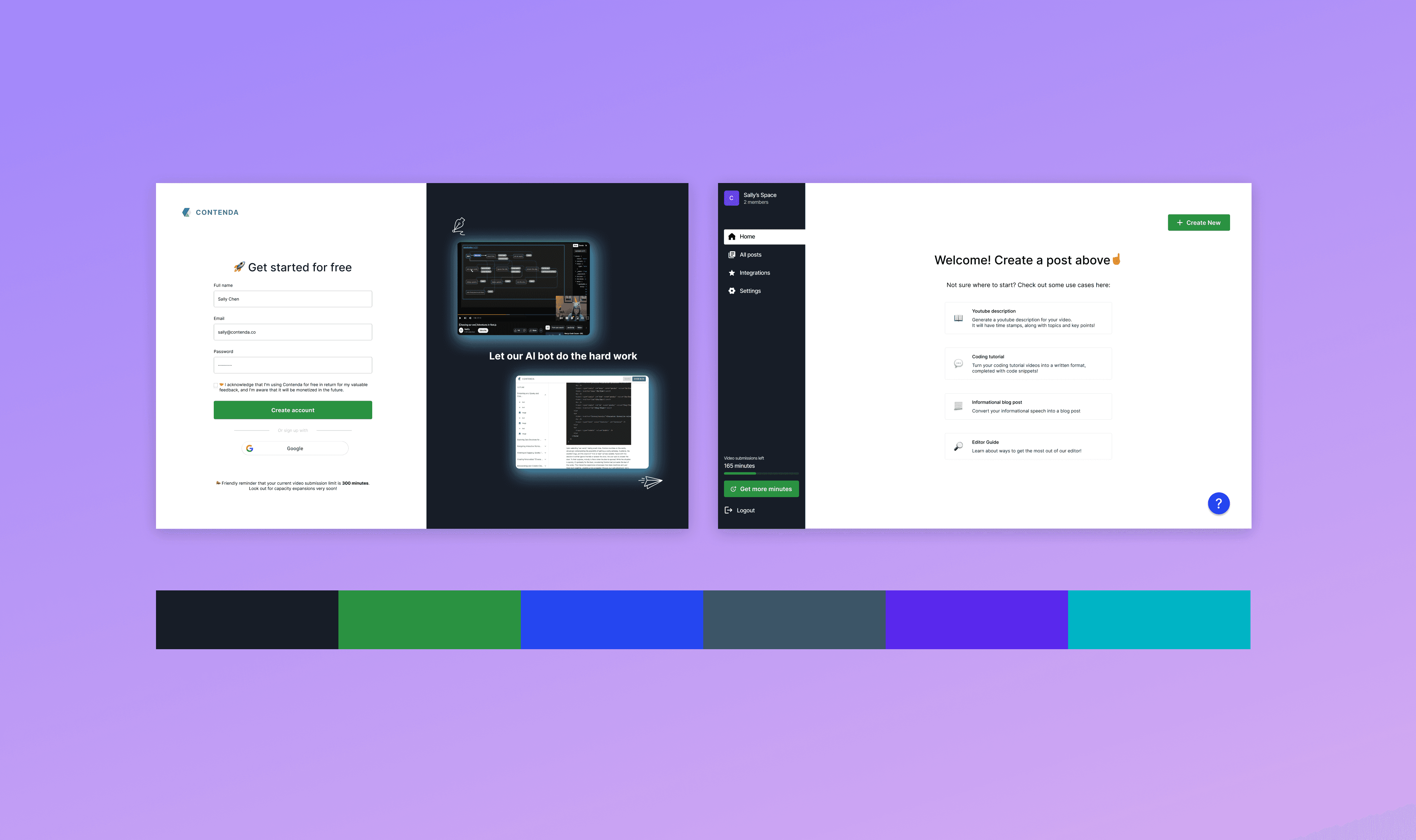
Our legacy palette gave off a stoic corporate vibe that misaligned with our AI-savvy, content creator audience and brand. It was also far from accessible, where many colors failed to meet AA standards for contrast.
Before: a palette giving off stoic corporate vibes
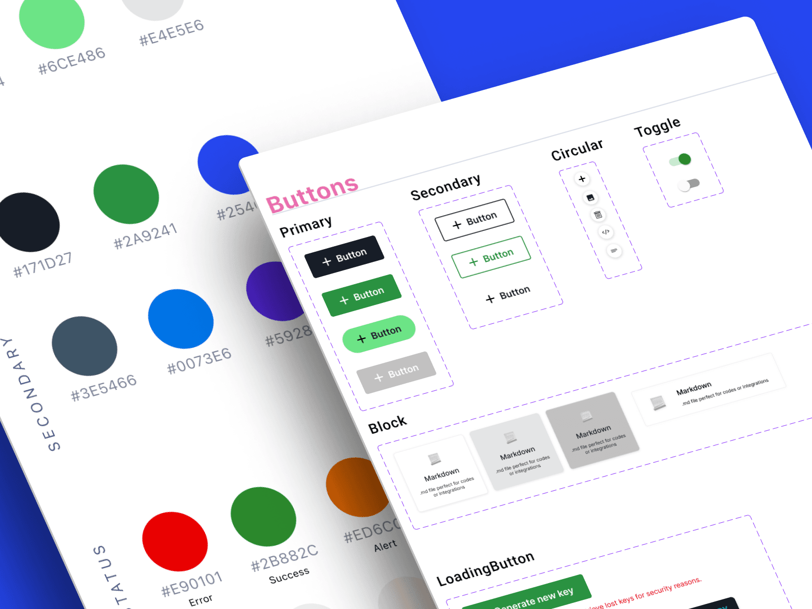
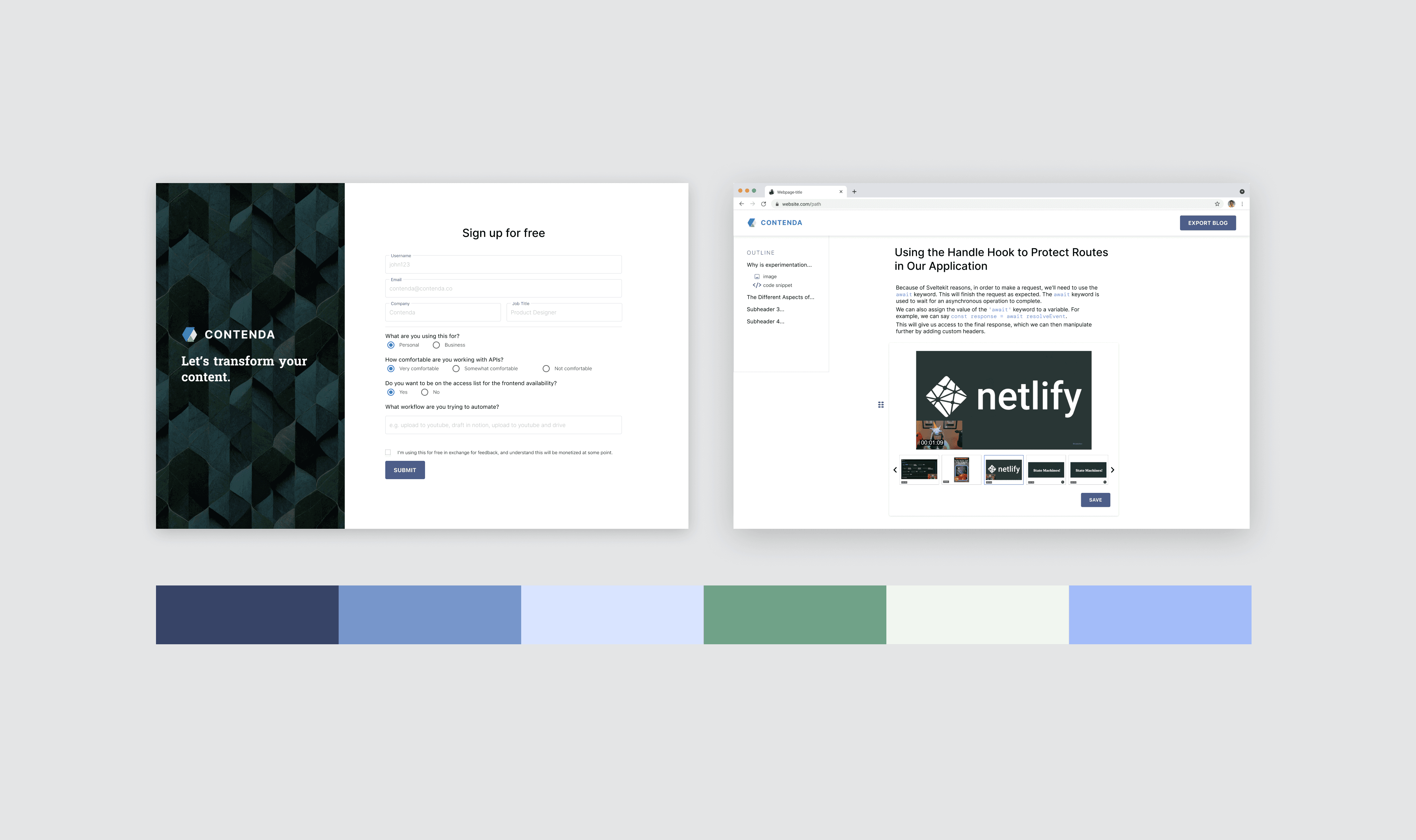
I leveraged AA compatible palette generators for inspiration, focusing on colors that echoed with our brand values. A notable shift was from a dated blue to an "OpenAI Green" that resonated with our AI-savvy users. Recognizing the importance of code quality and system scalability, I also added color tokens to the codebase, making sure everything was in perfect sync.
After: a revamped, richer palette in sync with Contenda's brand
Case 2: Creating universal yet unique interactions
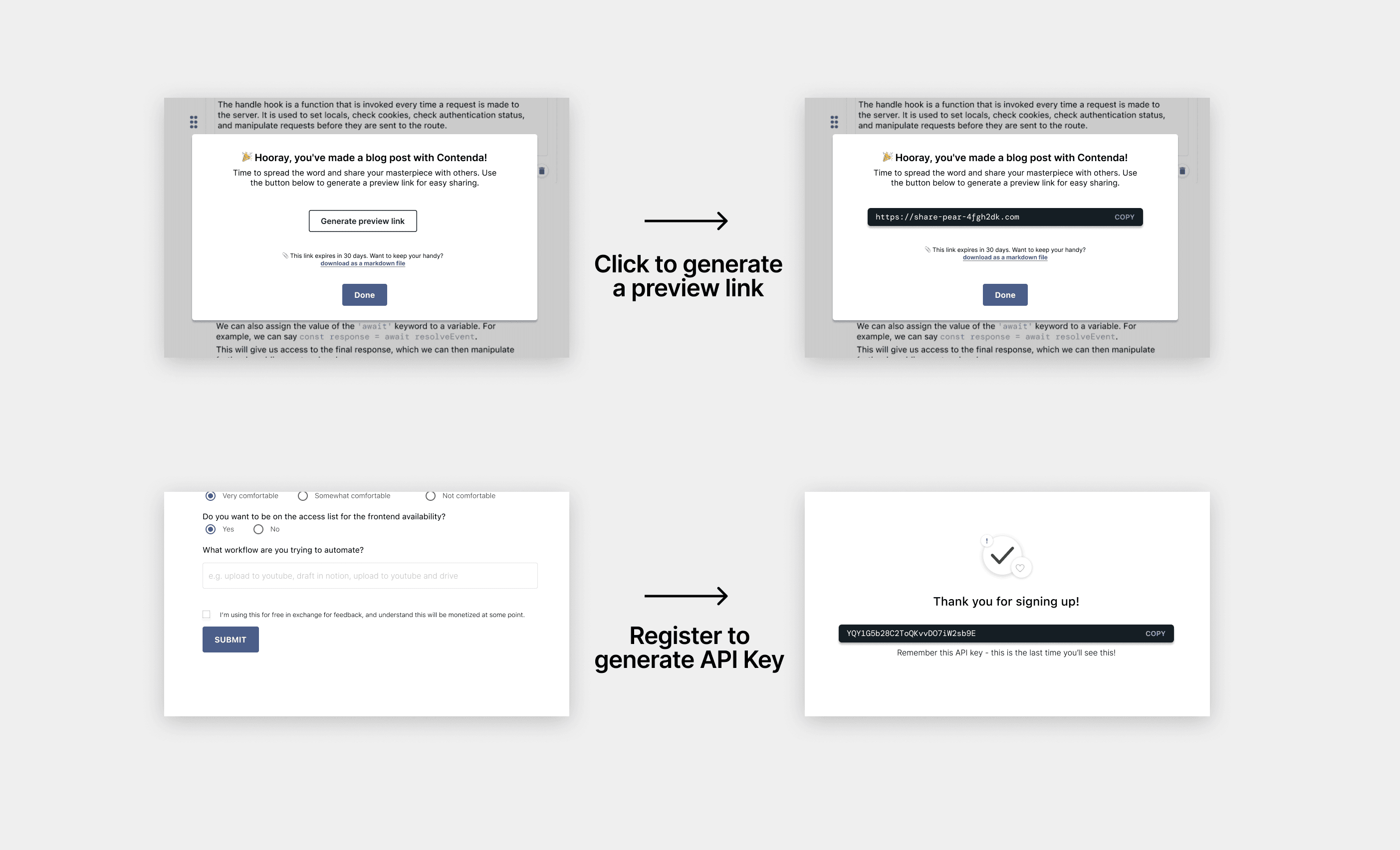
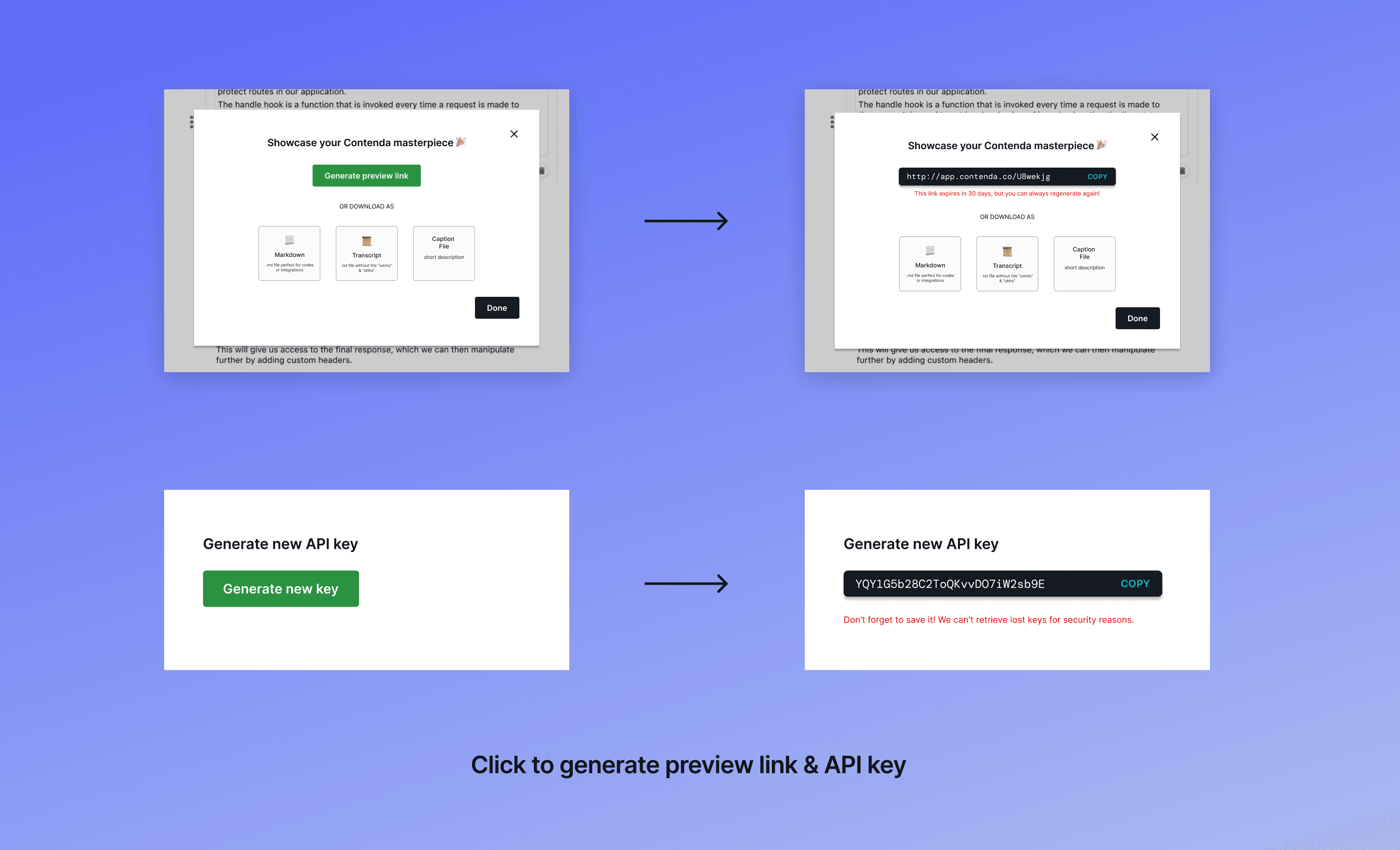
We often needed buttons to generate unique links and codes. Instead of designing a new button every time, I created a "Loading Button" component that does the job. I also enhanced the button with micro-interactions, like the text transition from “copy” to “copied” upon action completion.
Before: different interactions with the same frontend logic
After: unified interactions
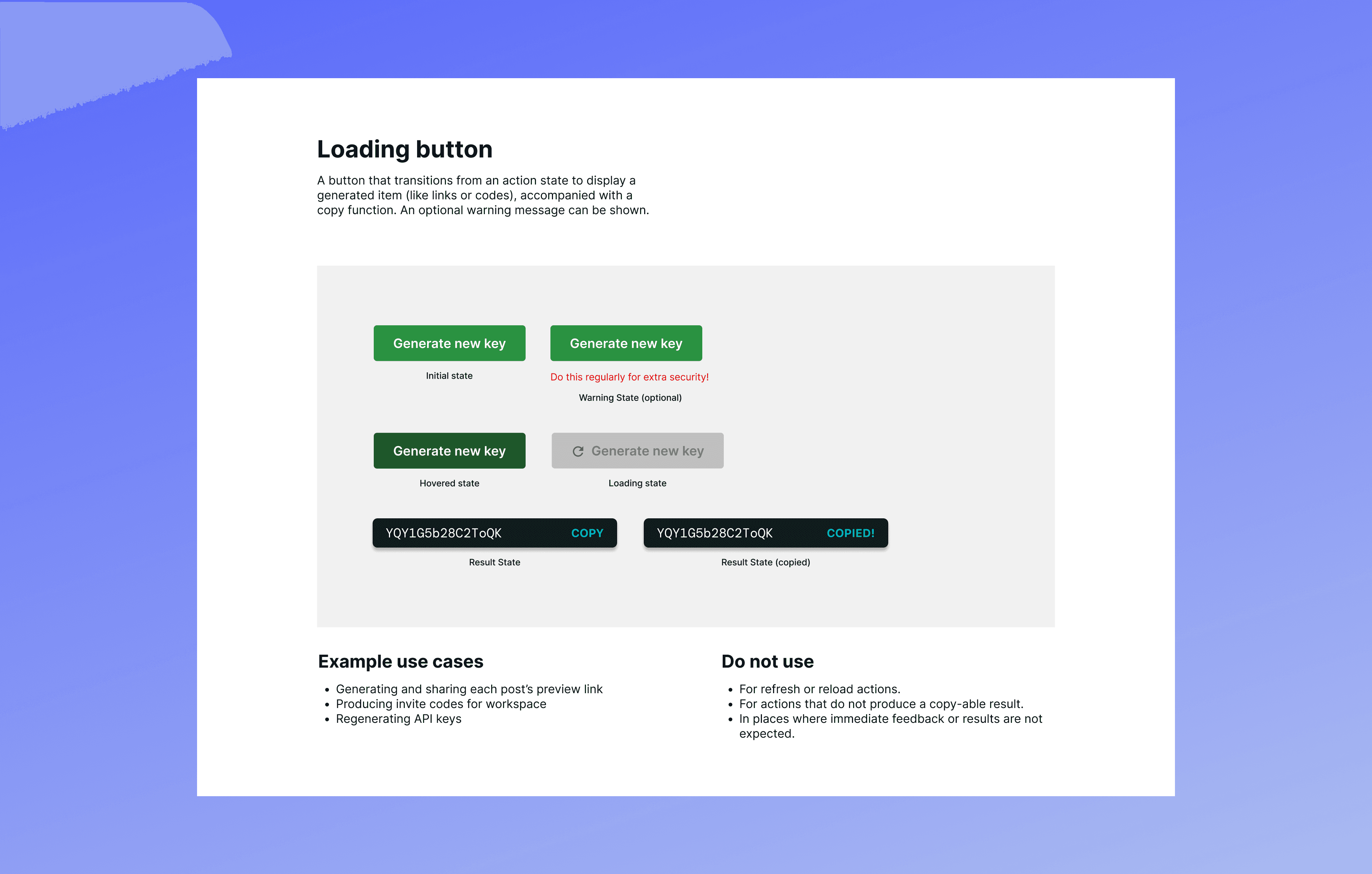
Of course, the button wasn't merely a visual asset. I made sure that its documentation encapsulated not only style specifications/code snippets but also contextual guidelines for appropriate use cases.
Documentation for loading button
Case 3: Aligning layouts with codebase
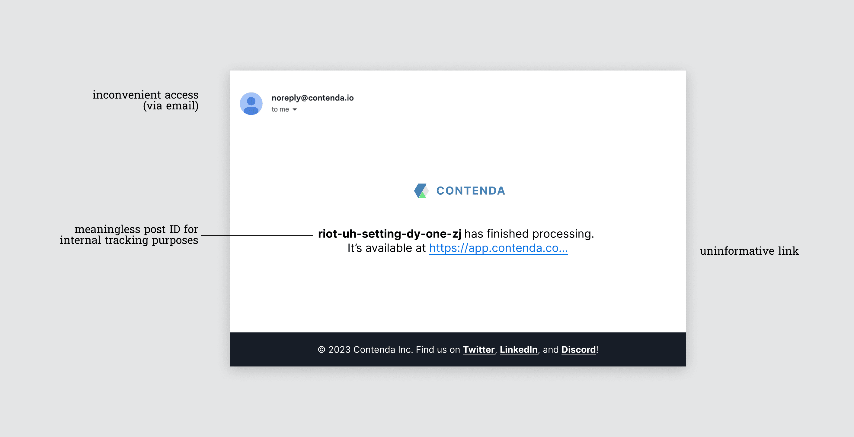
In the past, users were limited to accessing their posts through email alerts. This was highly inconvenient (they couldn't even view the post's title!), inefficient…the list continues. Thankfully, with the new dashboard I designed, there was an opportunity to relocate these posts from the inbox and design a new layout for each post.
Before: when users had to open their emails to access links to each post
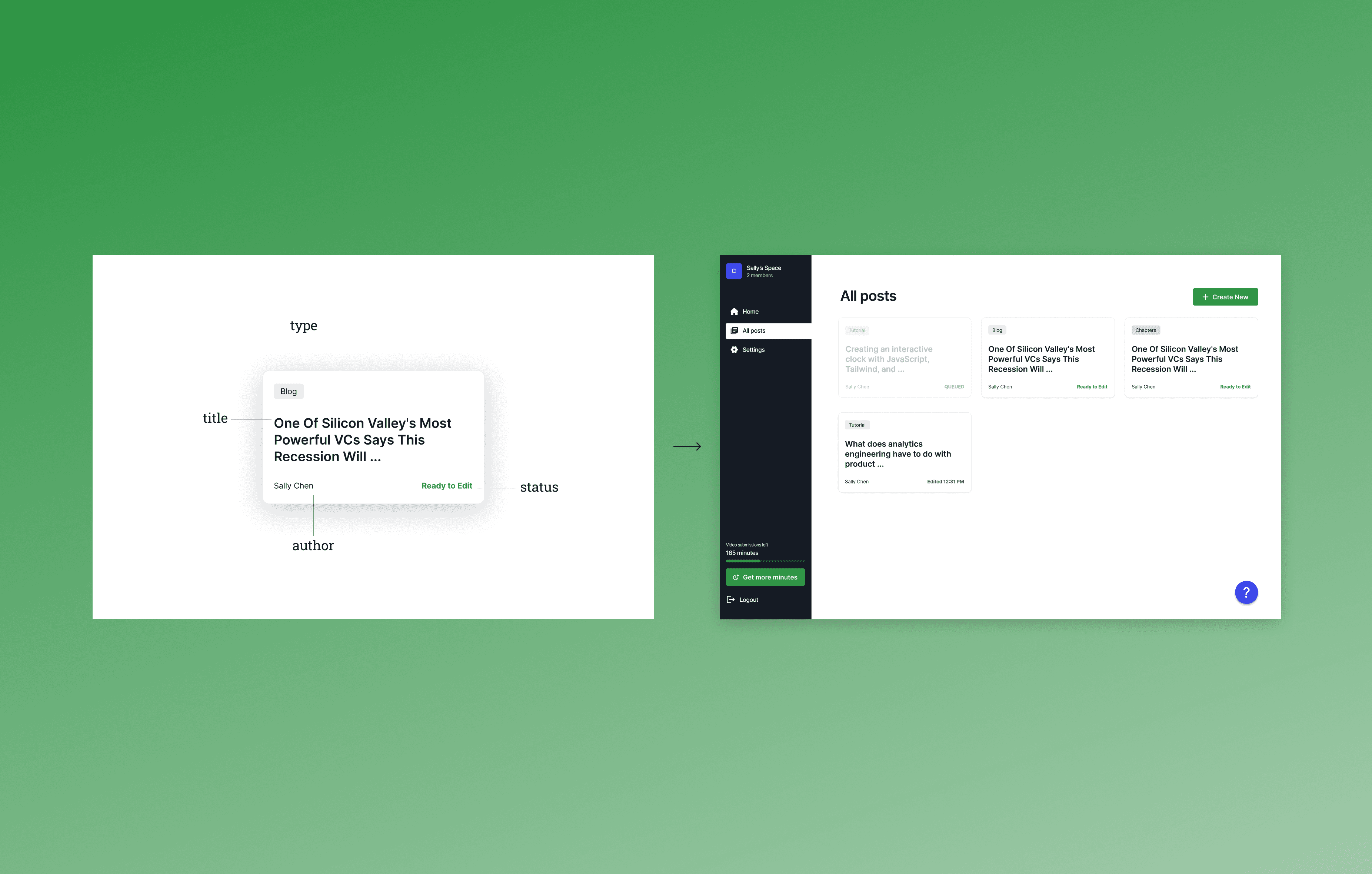
Our platform’s architecture offered me design inspirations - since each post in the codebase was its own component. l reflected the same structure on the dashboard, displaying each post with the same properties (title, type, etc...) in a card layout. This not only made it easier for the frontend to customize this component down the road, but also served as a debugging tool for visualizing component states!
After: now users are able to visualize each post's properties at a glance
The impact
The impact of my design overhaul was profound. Beyond just aesthetics, the design system bolstered accessibility, shifted us from sporadic design references to standardized component naming, and drastically amplified our development efficiency.
95%
Component adoption across platform
90%
Increased WCAG AA compliance
5x
More efficient development process
“Having reusable components helps me build faster, stay visually consistent, and fix bugs holistically in one place!” - frontend
With more bandwith, I would…
As the design system evolved concurrently with the development of new features, time constraints limited my documentation. I was able to synchronized styles and tokens across Figma and the codebase. I also established foundational branding and visual guidelines on ZeroHeight.
With additional time, I would have preferred to extend our documentation to Storybook. This would facilitates building UI components in isolation, allowing the frontend to focus on specific states and edge cases without the overhead of executing the entire application.
Reflection
As the sole designer, advocating for a new design system was a considerable challenge. My biggest realization was how effective design advocacy demonstrates how design can be a strategic asset that drives both user satisfaction and team efficiency. Throughout this project, I was also able to dig deep into visual design, thinking about all the ways we might use each component and designing both aesthetically pleasing and functional elements.

